Thursday, July 24, 2014

Books and Books

Meet Lydia.

 I am dating her older brother so she is practically my younger sister and I love her! She is starting off her senior year with a missions trip to Ecuador.  She has the sweetest heart and I am so glad I had the opportunity to shoot her senior pictures. The most significant shot I got of her displays her love for reading and writing. It reminds me that passions are worth being pursued. Always go after your passions Lyd! I created a behind the scenes video for this shot. Hope you like it!

Books and Books


Before:

After:


Wednesday, April 9, 2014

Here's To The End Of My Sophomore Year

I feel slightly exhausted from photography. Since I had five core classes this quarter I have several projects a week. I wish I could have posted more but most of my time was quickly filled up by homework, and once I was free all I could do was hop in my jammies and watch hours of mind numbing TV. So I apologize for my inability to schedule my time and make good use of it but here is my favorite pieces from this quarter.
Lighting Class:

Creative Photography Class:
Advanced Photoshop:
It's kind of hard to believe that I'm already a Junior! I still have no idea where I want to go with photography but it is still so fun developing my style!

Monday, March 3, 2014

The Mirror Series

Reflection
     I don't always like the projects we are given in school. Either they are too specific or they are something completely different from my style. This series was different. The only requirement was "reflection". These pictures are what I came up with.


My favorite is definitely the last one. I spent the most time on it and it followed the original idea I had for the shoot. I spent a lot of time adjusting colors and of course adding the shards of mirror.
Special thanks to miss Rachel Cox for modeling!

Friday, February 28, 2014

The Quieter Things

Minimalism: A style or technique (as in music, literature, or design) that is characterized by extreme spareness and simplicity -Merrium-Webster Dictionary

     I remember when I first started art I felt like all of my ideas had to be larger than life with elaborate Photoshop as my tool to create visions beyond what I was capable to capture with the lens. I was always better at editing than I was at strait photography. I took a photo then edited it into a great one but now I feel like I have grown as a photographer to meet where I was as a Photoshop artist. One thing I have really noticed about my personal style lately is that it is largely influenced by the minimalism movement. I have learned that the beauty of the photo is enough and that Photoshop is a tool to enhance. While I do still love composing fantasy out of reality, I can say that I am enjoying the art of photography in its purest form which is something I was unable to do several years ago.

     Currently at my college, almost every time we critique each other's work in class someone will say about another's work that their subject is too centered and it would be better if they framed the image with the subject lying on one of the thirds. In some instances I could agree, but there were plenty of times when I was irked at the phrase "too centered". Minimalism praises symmetry which typically leaves the subject directly in the center. When an image is well executed then the minimalist styling is quite soothing. I love knowing that the image could do nothing with anything more. It's a style that no critique can add to.


     Here are a couple shots I have been taking recently that I really love because of how simple they are. They are close to me even though I wasn't working on them until 2 A.M. on Photoshop.


Minimalism is where the frail are seen and the quiet are noticed. It is where subtle is blinding and chaos is ignored. It is the poet with one line and the painter with one stroke.

P.S. Try to ignore the watermark in the images now. I only do it to protect myself and my art.

Friday, February 14, 2014

My Stance on Photoshop

Negative views of Photoshop
     We live in an age where we no longer trust photographs anymore due to Photoshop and other photo editing programs. People will passionately critique fashion magazines for over Photoshopping their models and twisting society's view of what beauty is. I think it has come to a point where Photoshop has a lot of negative views. As a photographer Photoshop is simply a tool I use. I feel so fortunate to live in an age where it is so quick to fix elements in my photographs. I can take out the giant pimple on a person's nose because they unassumingly wouldn't want it in a permanent photograph. I get color into my photographs that wouldn't exist in nature. It's an artistic tool used to manipulate the world for a completely new view whereas before photographs just replicated scenes as they were seen in real life.
There is a line
    I am always on Photoshop and I don't think I will ever stop using Photoshop but I do believe there are standards to be held. Being an American woman I feel all the pressure the media places on us to look skinny and perky. One rule I try to always stick by is keeping a woman's natural figure in the photographs. Tools used to remove fat in Photoshop are giving woman an unreachable vision of what beauty is.
People want to look great
    To be completely honest I do airbrush skin and I am sure it is very obvious in my photos because my models have completely smooth skin. What I want people to understand about art is that it is a representation of life. Paintings, photographs, drawings and pretty much any other form of art will have a piece of the artist inside of it. My style has come to the point where I remove blemishes and create a smooth skin. I feel like my photographs are heavily exaggerated to the point where it is obvious that Photoshop work was done in order to romanticize the image. I don't try to create this false view of a person and try to trick the viewer into thinking they are looking at an unnaturally gorgeous person but that they are looking at a gorgeous photograph.
Before


After


Wednesday, January 8, 2014

Photoshop Tutorial: Adding Textures

Textures are a great way to add a little drama to a photo without adding a whole ton of work. They can give a great vintage effect or even add grunge to a photo to make it more edgy. In order to understand how to add textures to a photo, you need to understand how layer modes work.
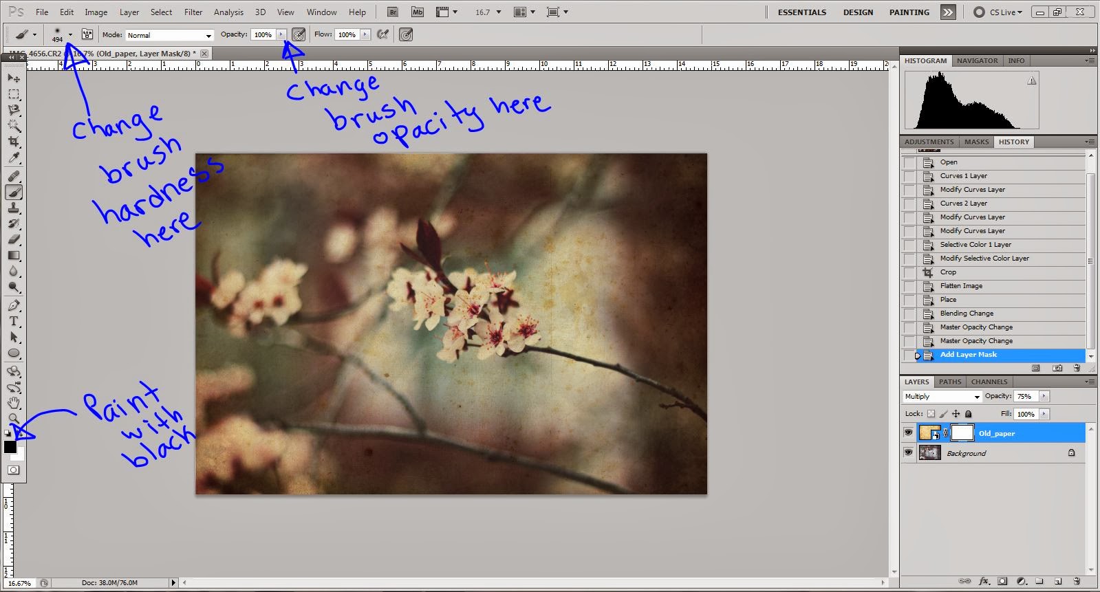
This is how my workspace is usually set up. I have my layers panel at the bottom left corner. If you don’t have your layers panel open, you can open it by going
Window > Layers
If you have your work-space how you want it then you can go ahead and open the photo you would like to add texture to.


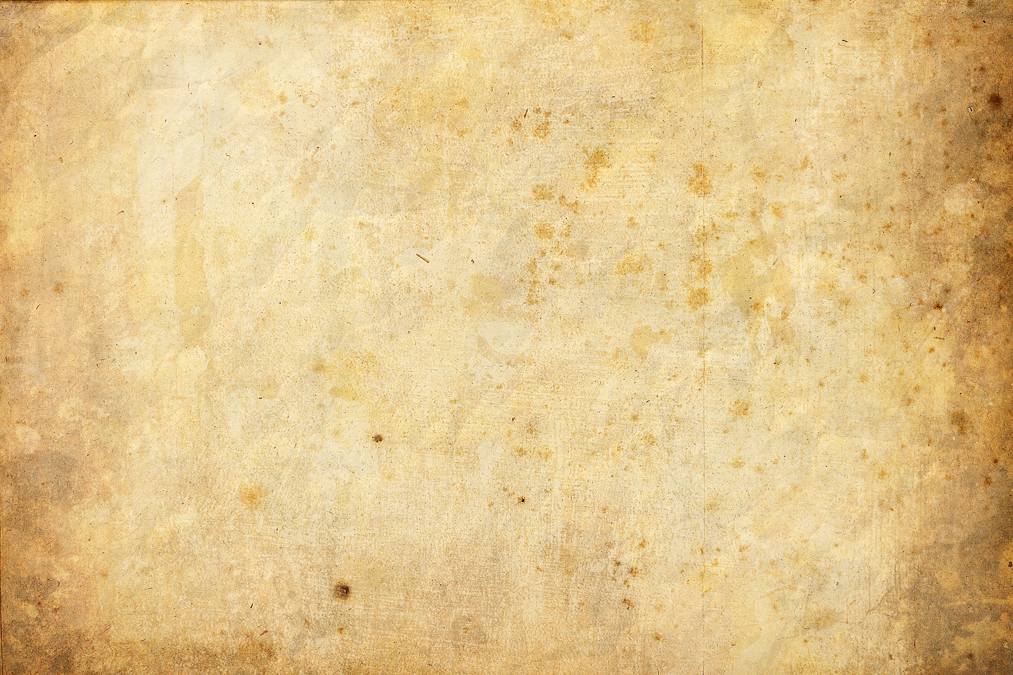
I am going to add a vintage texture to this photo to kinda age it just a bit. I have this paper texture I found at:
Once you have this texture (or the texture of your choice) downloaded to your computer, drag and drop the texture from your files onto the top of your photograph in Photoshop. Resize the texture if it does not cover the entire photograph. The texture’s layer should be the only thing you see and this is where layer masks come in. Right now the texture’s layer mode is set on normal. If I were to change the layer mode the underlying image will be able to be seen. 
These are a few of my favorite layer modes I like to use with photographs. I kept the opacity at 100% so that you can see the effect they really have.
1: Normal
2: Darken
3: Multiply
4: Color Burn
5: Linear Burn
6: Darker Color
7: Overlay
8: Soft Light
9: Hard Light
Try out all of the layer modes to see what they all do. They all have a different effect and can help you reach the style you might be going for. Each layer mode looks different on different photographs as well. If you find one you like for one image it might not look as good on another. For this particular image that I am editing, my favorite layer mode is multiply.

I don’t like how intense the texture is so to tone it down I will lower the opacity to about 75%
If you like how it looks you can definitely stop there but I want my flowers to have a little less of the texture on them so they stand out better. To do so I will create a layer mask for my texture layer.
Select your brush tool and set the hardness to 0. Lower the brush opacity to 25% Make sure the color you will be painting with is black.
Any part of the photo that I will paint black will be erased. I lowered the opacity because I did not want all of it to be gone, only some of it. If you want to bring the texture back then you can paint the layer mask with white.
Now to finish with the final touches I will add a curves layer just to lighten it up a little
In order to save your photo as a jpeg you have to flatten the image. To do so right click any layer then click flatten layer. Save it and then you are done!

Let me know if you have any questions, comments, or show me what you used this technique with! Thanks for reading!!!
-Ruthie's Magical Camera

Saturday, January 4, 2014

Unravel

My latest photo titled Unravel leaves questions to what I meant when I decided to create such a weird piece. As an artist I find myself constantly comparing my art to other artists determining if I am better or worse. No matter how hard I try, this damaging habit sneaks itself back into my mind any time I see a photograph. Sometimes it just causes me to Unravel. Comparison is harmful, jealous, and bitter, but what fuels comparison is the strive to be the best. Striving to be great at what you do is what pushes us as humans to constantly better ourselves. It means we don't settle for good enough. 
The most difficult thing for me as an artist is understanding that my best is enough. I hope I never lose the drive to take pictures and work as hard as I can on them, and I hope I never demand so much of myself that I am disappointed when I feel inadequate to another artist. I am not one for new year's resolutions, but this is one that I need to work on for all year and then for the rest of my life because as long as the strive is there the habit of comparison will always be present.